


MINT SQUARE ARTICLE
DOOH Creative Best Practices
Free Creative Checklist for DOOH Campaigns to download
DOOH creative is consumed differently from display, social or CTV. People see it while walking, commuting, shopping, waiting or moving through a public environment, often with only a few seconds of attention. That means it has to be simple, legible, high contrast and aware of its context. A beautiful creative that can’t be understood quickly is not a strong DOOH creative.
Before creative development starts, it’s worth knowing exactly where the campaign will run. The planned screen environment, viewing distance, format and technical specifications directly shape decisions like typography, colour contrast, animation and layout, so creative development and media planning should happen together from the start rather than one after the other. Resolution, aspect ratio and file format requirements vary by media owner and screen type, so request the specification sheet for each environment early in production rather than assuming one master file will work everywhere.
The three second reality
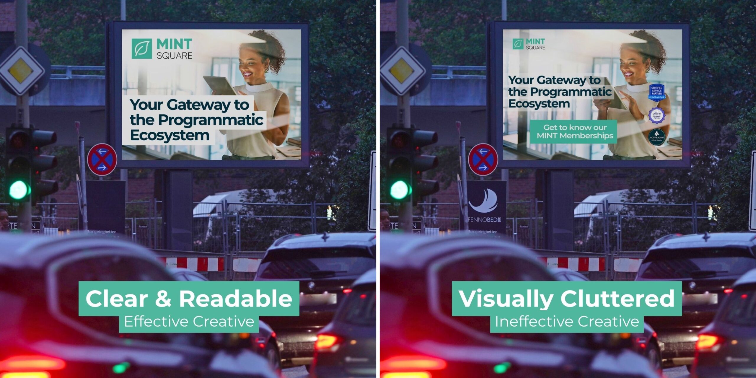
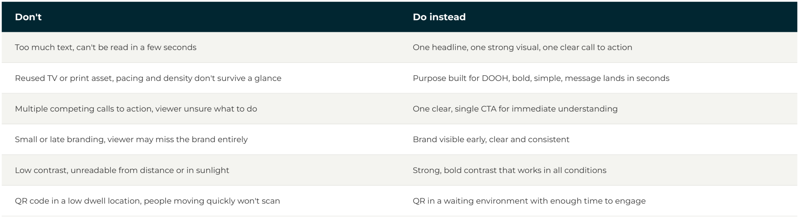
A passer-by typically has one to three seconds of attention for a DOOH screen. Every creative decision should be filtered through that constraint: one core idea, one clear visual focal point, and no more than five to seven words of primary copy. If the concept needs a paragraph to explain it, it isn’t a DOOH concept yet.
The most useful test before anything goes live is a simple one. Show the concept to someone for three seconds, then ask what it was for. If they can’t answer clearly, the creative needs to lose an element, not gain more explanation. It’s also the most constructive way to push back when a client wants to add just one more line to an already busy layout.
Typography built for the viewing distance
Legibility, how easily text can be read at the actual viewing distance and speed, scales with viewing distance rather than screen size. A widely used rule of thumb for outdoor screens is roughly one inch of letter height for every ten feet of intended viewing distance, which is why a roadside billboard seen from a moving vehicle needs significantly larger type than a shopping centre screen viewed from a few metres away. Bold, high contrast sans-serif typefaces hold up best. Thin weights, tight letter spacing and decorative or script fonts tend to be difficult to read in the time available.
Colour and contrast that survives daylight
Outdoor screens compete with daylight, glare and a visually busy environment, so contrast has to work harder than it would on a television. Strong, high contrast pairings hold up in bright conditions, while low contrast, pastel on pastel combinations that look elegant on a design monitor can disappear entirely in direct sunlight. It’s worth testing any creative at a small size and viewing it from a distance before approving it.
Motion depends entirely on the environment
Whether motion can be used at all depends on where the screen sits, so this is really two different design briefs rather than one.
Roadside and traffic facing screens are often subject to local regulations that permit only static creative or heavily restrict animation, transitions and flashing content for road safety reasons. These rules vary by country, city and even individual site, so the media owner’s specification sheet is the final word. The safest approach is to design roadside creative as a static execution first, one frame that works on its own, and treat any permitted motion as a bonus rather than the thing carrying the idea.
Pedestrian and dwell environments, malls, transit hubs, gyms, airports and elevators, are where motion earns its place. Subtle animation is one of the most effective ways to draw the eye of someone who isn’t already looking at the screen, though the same discipline applies: motion should guide attention toward the message, not compete with it. Fast cuts, busy transitions and multiple moving elements reduce legibility even where they’re technically allowed.
One detail applies everywhere. Spot lengths typically run five to fifteen seconds depending on the inventory, with ten seconds the most common standard across many European networks. Since a viewer might catch any random moment of the spot rather than the beginning, the brand and core message need to stay visible throughout the whole thing rather than being revealed only at the end the way a television ad might. If someone only sees seconds three to five, they should still know who’s talking and what the message is.
Letting creative adapt with Dynamic Creative Optimisation
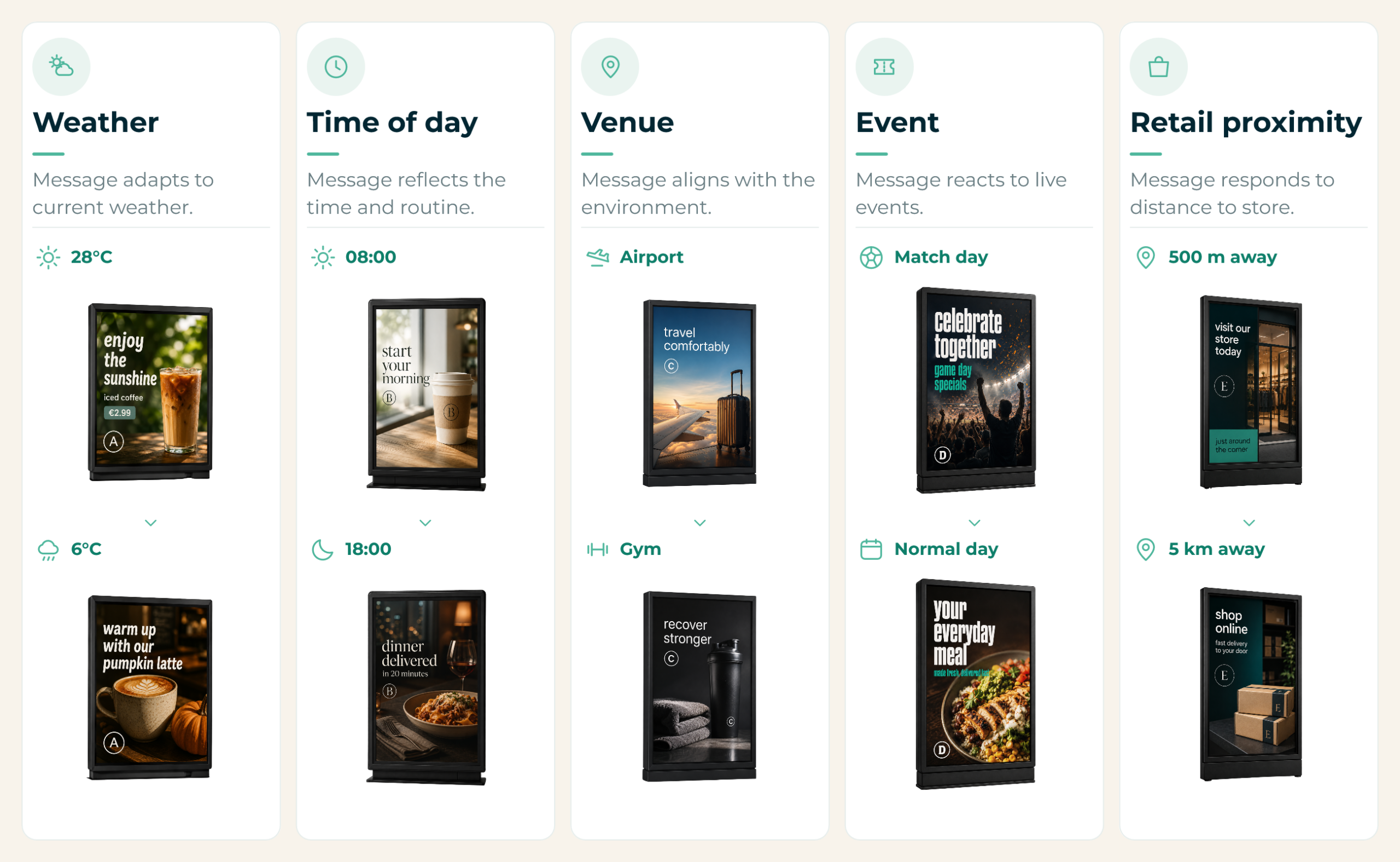
One of DOOH’s biggest creative strengths is that the message can adapt to its surroundings. Dynamic Creative Optimisation, DCO, makes this possible by automatically changing parts of an ad based on real time conditions such as weather, time of day, location or other contextual data. The changes don’t have to be dramatic. Many successful campaigns simply update a headline, product or offer while the rest of the creative stays the same.
To make this possible, DOOH campaigns are typically built from modular creative components rather than a single flattened design. Instead of producing dozens of finished variations, designers prepare individual assets, headlines, product shots, logos, calls to action, which sit in a content feed. Based on predefined rules, the DCO setup then assembles the right combination for each situation automatically, which makes updates far easier and lets a campaign adapt to changing conditions without redesigning the whole asset.
The conditions campaigns most commonly trigger on are weather, time of day, venue, live events and proximity to a retail location, each swapping in a different message suited to that moment.
Match the tone, and the call to action, to the moment
Tone should shift with the environment as much as content does. Relaxed and travel relevant in an airport, energetic and performance led in a gym, quick and direct on transit where exposure is brief and repeated, and a more professional register in a business district.
A call to action only works when the environment gives people time to act. A QR code or short URL can be powerful in a high dwell setting, a waiting area, a mall, a gym, but is wasted on a fast moving roadside screen. MINT Square’s VILSA campaign is a good example of getting this right: the creative invited a physical world audience to submit a team video, matching a clear action to an engaged, relevant audience rather than asking for more than the moment could support.
Common creative mistakes
Review before it goes live
Before any DOOH creative goes live, it’s worth checking whether the main message can be understood in three seconds, whether the brand is clearly visible without depending on a small logo, whether there’s one main idea rather than several competing messages, whether the type is large enough for the environment and viewing distance, whether colour contrast holds up in daylight, whether motion improves understanding rather than distracting from it, whether the call to action suits the dwell time, and whether every spec, dimensions, duration, file type, weight and safe zones, has actually been checked, ideally at small size and from a distance rather than full size on a design monitor.
A simple example of all of this working together: a beverage brand can run one media buy across a city network where the creative automatically swaps between an iced coffee execution above roughly 22 degrees and a hot drink execution below 10 degrees, a single setup quietly delivering two contextually relevant messages with no manual intervention.
Key takeaways
Design for a few seconds of fragmented attention, one idea, one focal point, minimal copy. Legibility is about viewing distance, not screen size, so match type and contrast to how the environment is actually seen. Dynamic creative is DOOH’s biggest advantage over static formats, worth using whenever the buy supports it, but kept simple. And match the call to action to the dwell time, since the three second test is the fastest quality check available.
Frequently asked questions: DOOH
Roughly one to three seconds for most passers-by, which is why the rule of thumb is one core idea, one visual focal point, and no more than five to seven words of primary copy.
Around one inch of letter height for every ten feet of intended viewing distance. A roadside billboard seen from a moving car needs much larger type than a screen viewed from a few metres away in a shopping centre.
It depends entirely on the environment. Roadside and traffic facing screens are often restricted to static creative by local safety regulations, while pedestrian and dwell environments like malls, transit hubs and airports are where subtle motion can genuinely help draw attention.
It’s the ability for a creative to automatically change parts of itself, a headline, product or offer, based on real time conditions like weather, time of day or location, built from modular assets rather than one fixed design.
Reusing a TV, print or social asset without adapting it. Pacing and density that work in those formats rarely survive the three second glance a DOOH screen actually gets.